


Charts can be social artifacts that communicate more than just data


The degree to which someone trusts the information depicted in a chart can depend on their assumptions about who made the data visualization, according to a pair of studies by MIT researchers.
For instance, if someone infers that a graph about a controversial topic like gun violence was produced by an organization they feel is in opposition with their beliefs or political views, they may discredit the information or dismiss the visualization all together.
The researchers found that even the clearest visualizations often communicate more than the data they explicitly depict, and can elicit strong judgments from viewers about the social contexts, identities, and characteristics of those who made the chart.
Readers make these assessments about the social context of a visualization primarily from its design features, like the color palette or the way information is arranged, rather than the underlying data. Often, these inferences are unintended by the designers.
Qualitative and quantitative studies revealed that these social inferences aren’t restricted to certain subgroups, nor are they caused by limited data literacy.
The researchers consolidate their findings into a framework that scientists and communicators can use to think critically about how design choices might affect these social assumptions. Ultimately, they hope this work leads to better strategies for scientific communication.
“If you are scrolling through social media and you see a chart, and you immediately dismiss it as something an influencer has produced just to get attention, that shapes your entire experience with the chart before you even dig into the data. We’ve shown in these papers that visualizations do more than just communicate the data they are depicting — they also communicate other social signals,” says Arvind Satyanarayan, an associate professor in the MIT Department of Electrical Engineering and Computer Science (EECS) and member of the Computer Science and Artificial Intelligence Laboratory (CSAIL) and co-senior author of this research.
He is joined on the paper by co-lead authors Amy Rae Fox, a former CSAIL postdoc, and Michelle Morgenstern, a current postdoc in MIT’s anthropology program; and co-senior author Graham M. Jones, professor of anthropology. Two related papers on this research will be presented at the IEEE Visualization Conference.
Charts as social artifacts
During the height of the Covid-19 pandemic, social media was awash in charts from organizations like the World Health Organization and Centers for Disease Control and Prevention, which were designed to convey information about the spread of disease.
The MIT researchers studied how these visualizations were being used to discuss the pandemic. They found that some citizen scientists were using the underlying data to make visualizations of their own, challenging the findings of mainstream science.
“This was an unexpected discovery as, previously, citizen scientists were typically aligned with mainstream scientists. It took us a few years to figure out how to study this phenomenon more deeply,” Satyanarayan says.
Most research into data visualization studies how charts communicate data. Instead, the researchers wanted to explore visualizations from a social and linguistic perspective to assess the information they convey beyond the data.
Linguistic anthropologists have found that, while language allows people to communicate ideas, it also holds social meaning beyond the words people use. For instance, an accent or dialect can indicate that someone is part of a particular community.
By “pointing” to certain social meanings, identities, and characteristics, language serves what is known as a socio-indexical function.
“We wanted to see if things in the visual language of data communication might point to certain institutions, or the kinds of people in those institutions, that carry a meaning that could be unintended by the makers of the visualization,” Jones says.
To do this, the researchers conducted an initial, qualitative study of users on the social media platform Tumblr. During one-on-one interviews, the researchers showed users a variety of real visualizations from online sources, as well as modified visualizations where they removed the textual information, like titles and axes labels.
Stripping out the textual information was particularly important, since it mimics the way people often interact with online visualizations.
“Our engagement with social media is a few quick seconds. People aren’t taking the time to read the title of a chart or look at the data very carefully,” Satyanarayan says.
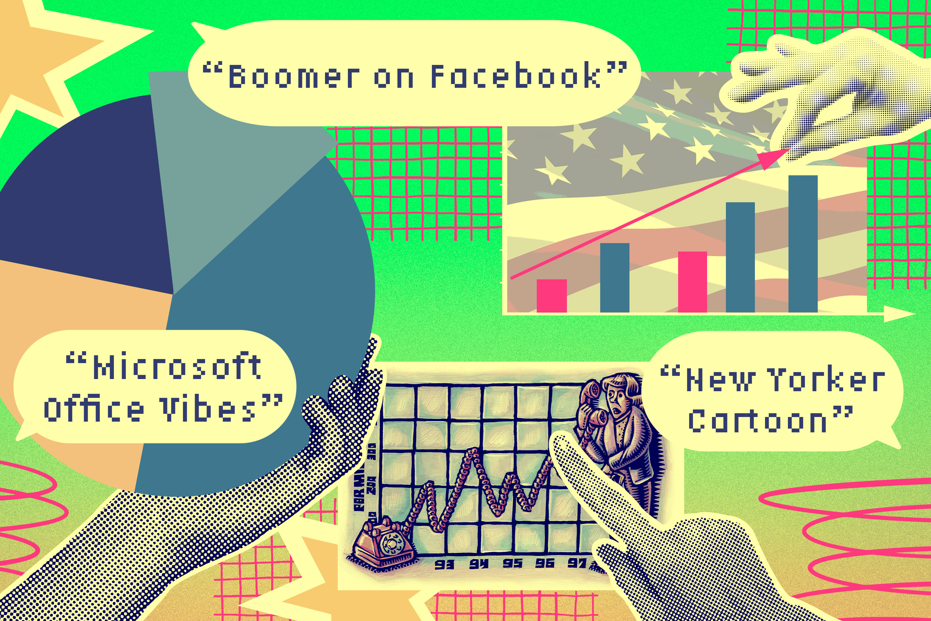
The interviews revealed that users made detailed inferences about the people or organizations who created the visualizations based on what they called “vibes,” design elements, like colors or the use of certain graphics. These inferences in turn impacted their trust in the data.
For instance, after seeing a chart with the flags of Georgia and Texas and a graph with two lines in red and black, but no text, one user said, “This kind of looks like something a Texas Republican (legislator) would put on Twitter or on their website, or as part of a campaign presentation.”
A quantitative approach
Building on this initial work, the researchers used the same methodology in three quantitative studies involving surveys sent to larger groups of people from a variety of backgrounds.
They found the same phenomenon: People make inferences about the social context of a visualization based on its design, which can lead to misunderstandings about, and mistrust in, the data it depicts.
For instance, users felt some visualizations were so neatly arranged they believed them to be advertisements, and therefore not trustworthy. In another example, one user dismissed a chart by a Pulitzer-prize winning designer because they felt the hand-drawn graphical style indicated it was made by “some female Instagram influencer who is just trying to look for attention.”
“If that is the first reaction someone has to a chart, it is going to massively impact the degree to which they trust it,” Satyanarayan says.
Moreover, when the researchers reintroduced text in the visualizations from which it had been removed, users still made these social inferences.
Typically, in data visualization, the solution to such a problem would be to create clearer charts or educate people about data literacy. But this research points to a completely different kind of data literacy, Jones says.
“It is not erroneous for people to be drawing these inferences. It requires a lot of cultural knowledge about where visualizations come from, how they are made, and how they circulate. Drawing these inferences is a feature, not a bug, of the way we use signs,” he says.
From these results, they created a classification framework to organize the social inferences users made and the design elements that contributed to them. They hope the typology serves as a tool designers can use to develop more effective visualizations, as well as a starting point for additional studies.
Moving forward, the researchers want to continue exploring the role of data visualizations as social artifacts, perhaps by drilling down on each design feature they identified in the typology. They also want to expand the scope of their study to include visualizations in research papers and scientific journals.
“Part of the value of this work is a methodological contribution to render a set of phenomena amenable to experimental study. But this work is also important because it showcases an interdisciplinary cross-pollination that is powerful and unique to MIT,” Jones says.
This work was supported, in part, by MIT METEOR and PFPFEE fellowships, an Amar G. Bose Fellowship, an Alfred P. Sloan Fellowship, and the National Science Foundation.
Latest Research News
- Neural activity helps circuit connections mature into optimal signal transmittersScientists identified how circuit connections in fruit flies tune to the right size and degree of signal transmission capability. Understanding this could lead to a way to tweak abnormal signal transmission in certain disorders.
- Creating AI that mattersHow the MIT-IBM Watson AI Lab is shaping AI-sociotechnical systems for the future.
- MIT Global Seed Funds catalyze research in over 20 countriesLaunched in 2008, the program has expanded exponentially and spent $30 million on high-impact research.
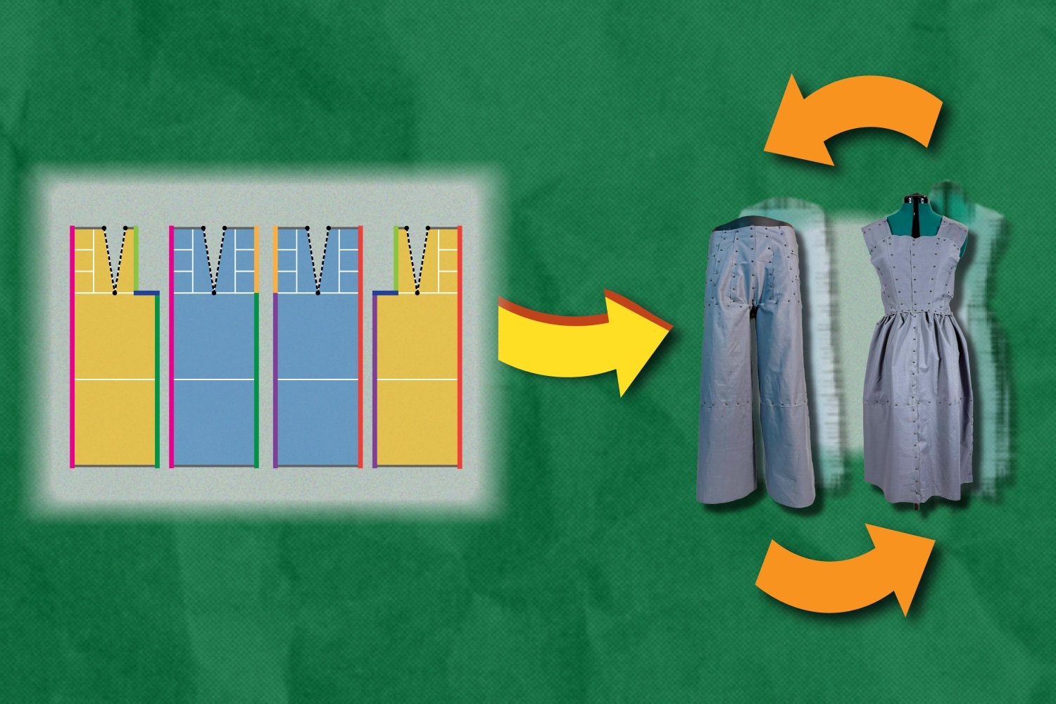
- New software designs eco-friendly clothing that can reassemble into new itemsTo reduce waste, the Refashion program helps users create outlines for adaptable clothing, such as pants that can be reconfigured into a dress. Each component of these pieces can be replaced, rearranged, or restyled.
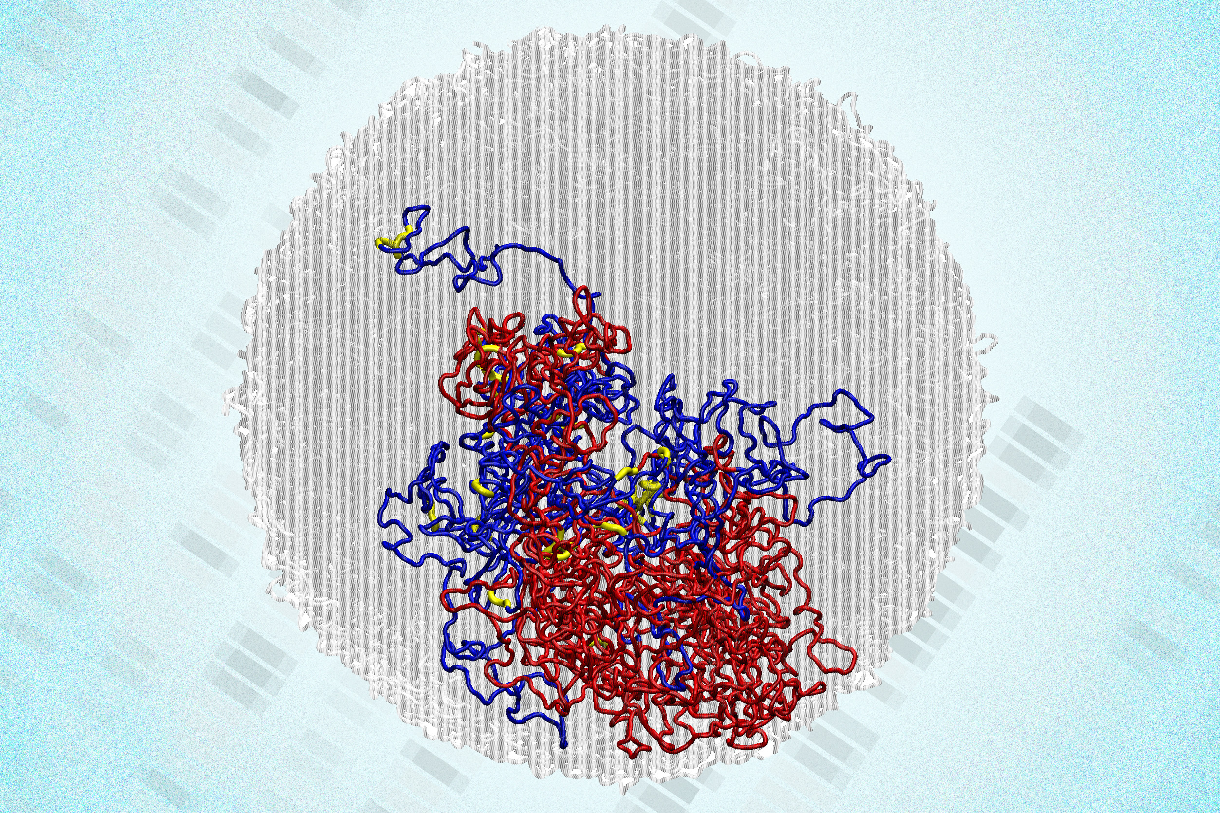
- In a surprising discovery, scientists find tiny loops in the genomes of dividing cellsEnabled by a new high-resolution mapping technique, the findings overturn a long-held belief that the genome loses its 3D structure when cells divide.
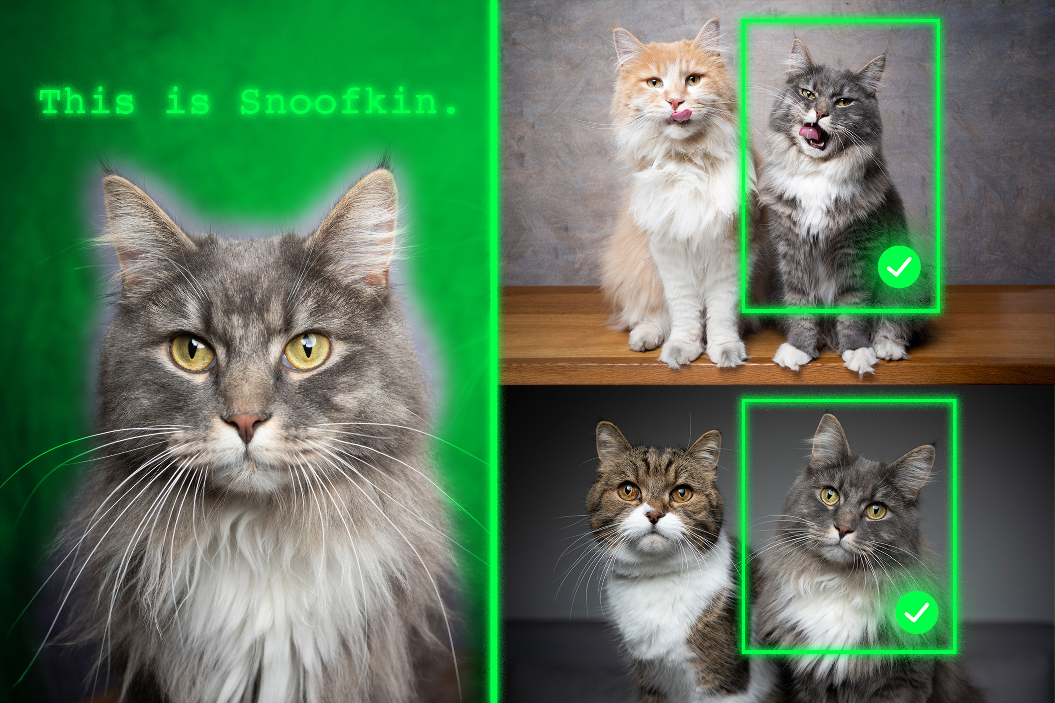
- Method teaches generative AI models to locate personalized objectsAfter being trained with this technique, vision-language models can better identify a unique item in a new scene.